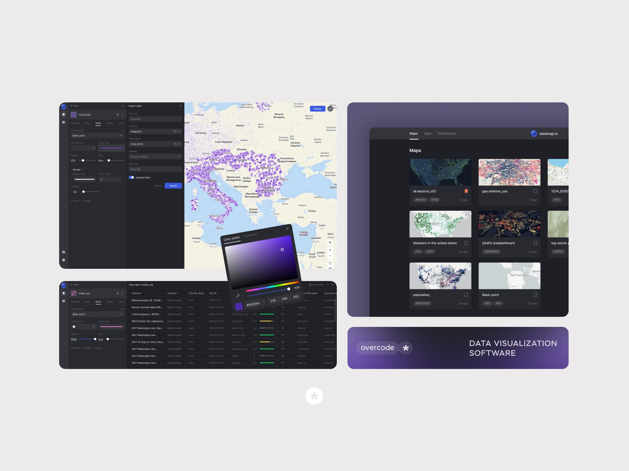
ThisThisdatadatavisualizationvisualizationtooltoolisisdesigneddesignedspecificallyspecificallyforforthetheneedsneedsofoflargelargebusinesses,businesses,offeringofferingananenterpriseenterprisesolutionsolutionforforvisualizingvisualizingcomplexcomplexdatasetsdatasetsononinteractiveinteractivemaps.maps.ItItempowersempowerscompaniescompaniestotomakemakedata-drivendata-drivendecisionsdecisionsininvariousvariousindustries:industries:OilOil&&Gas,Gas,InsuranceInsurance&&RiskRiskManagement,Management,Healthcare,Healthcare,RealRealEstate,Estate,FinancialFinancialservices,services,etc.etc.
About Project
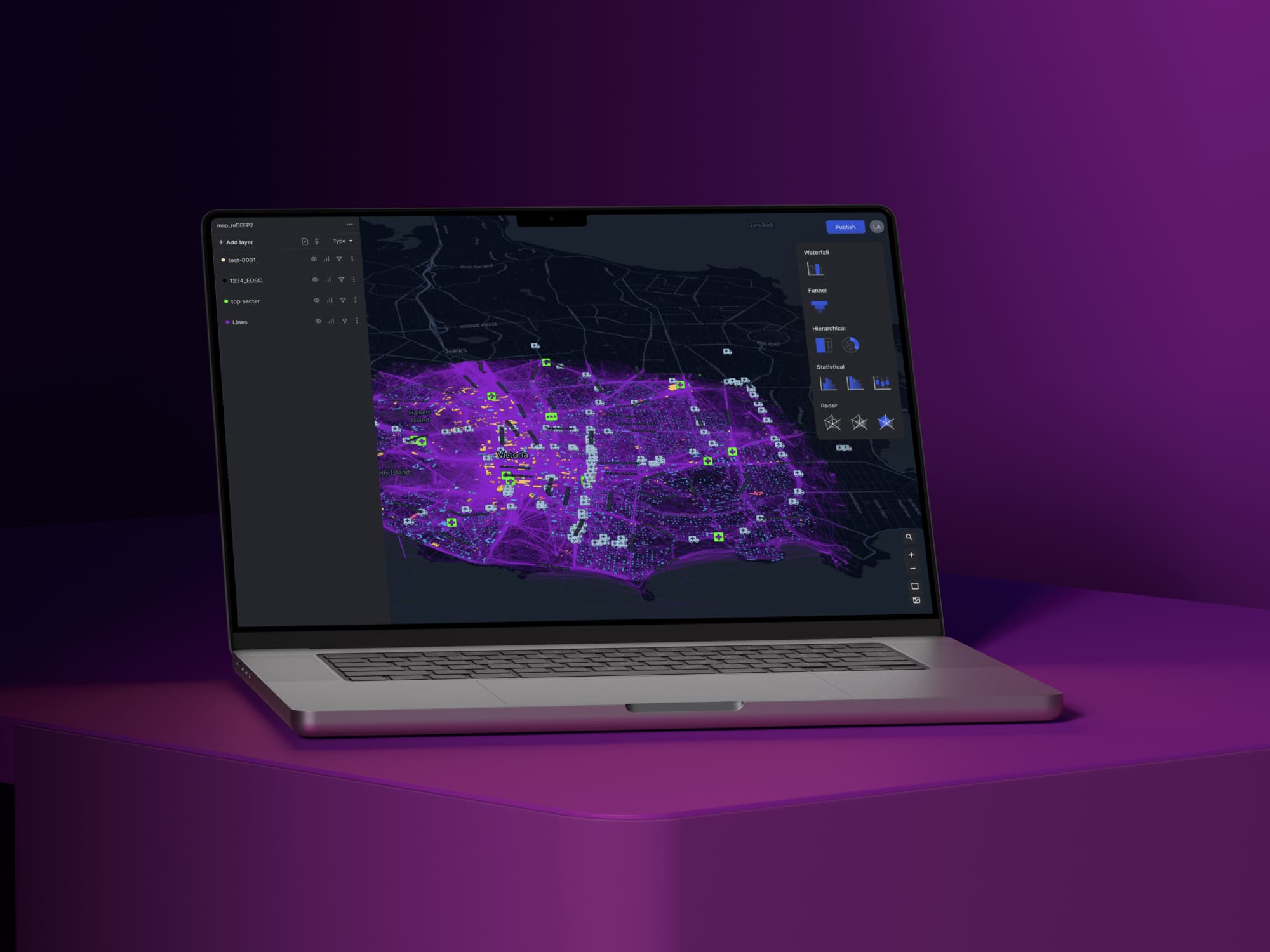
This B2B data visualization software transforms complex data into visually intuitive, interactive map, making it easier for businesses to uncover valuable insights. The software empowers users to identify patterns, trends, and correlations, facilitating more informed strategic planning, resource allocation, and decision-making processes.
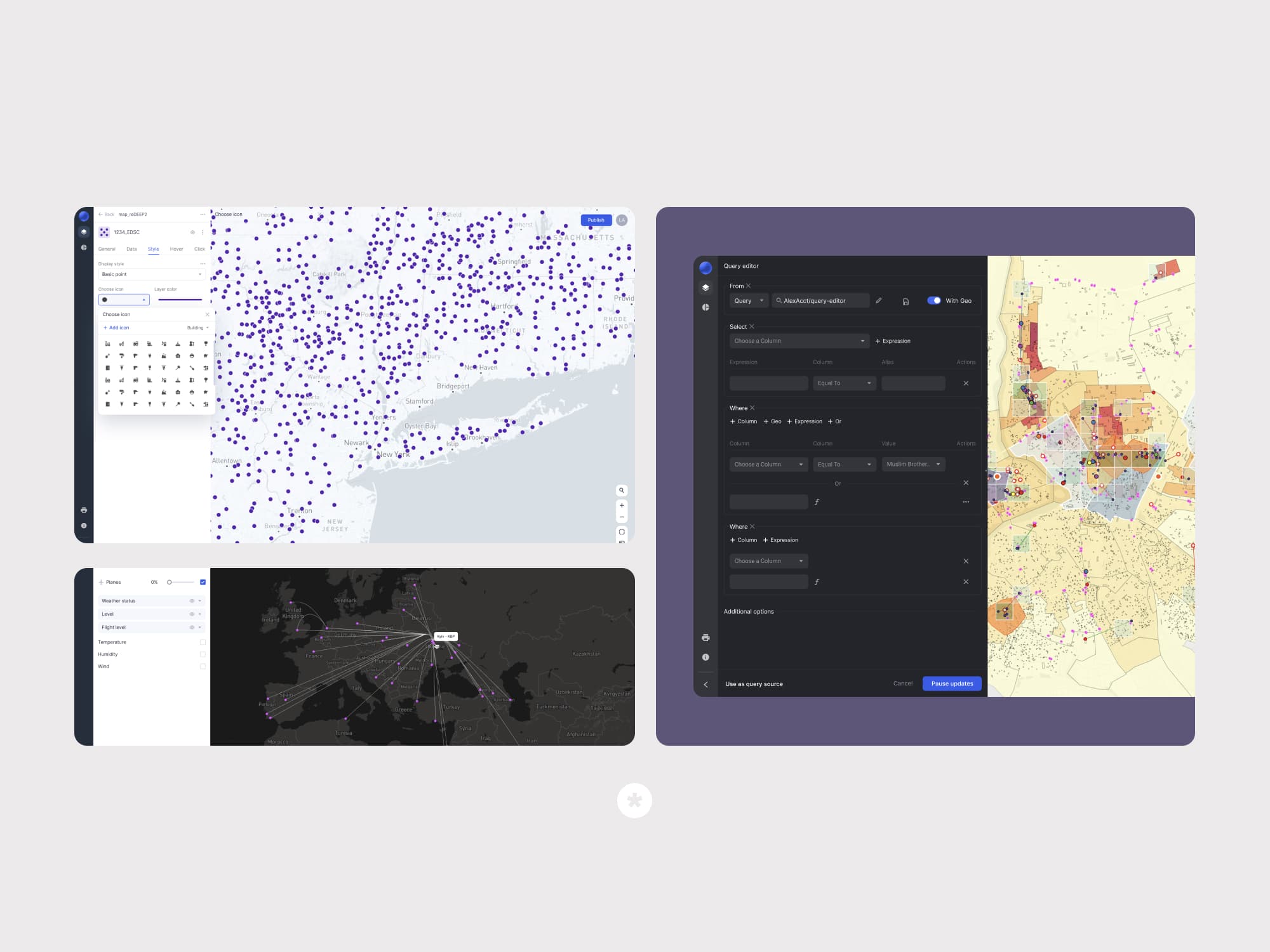
The core feature of this data visualization app is a built-in visual editor packed with a wide range of customizable parameters, allowing users to track and visualize any metric they choose.
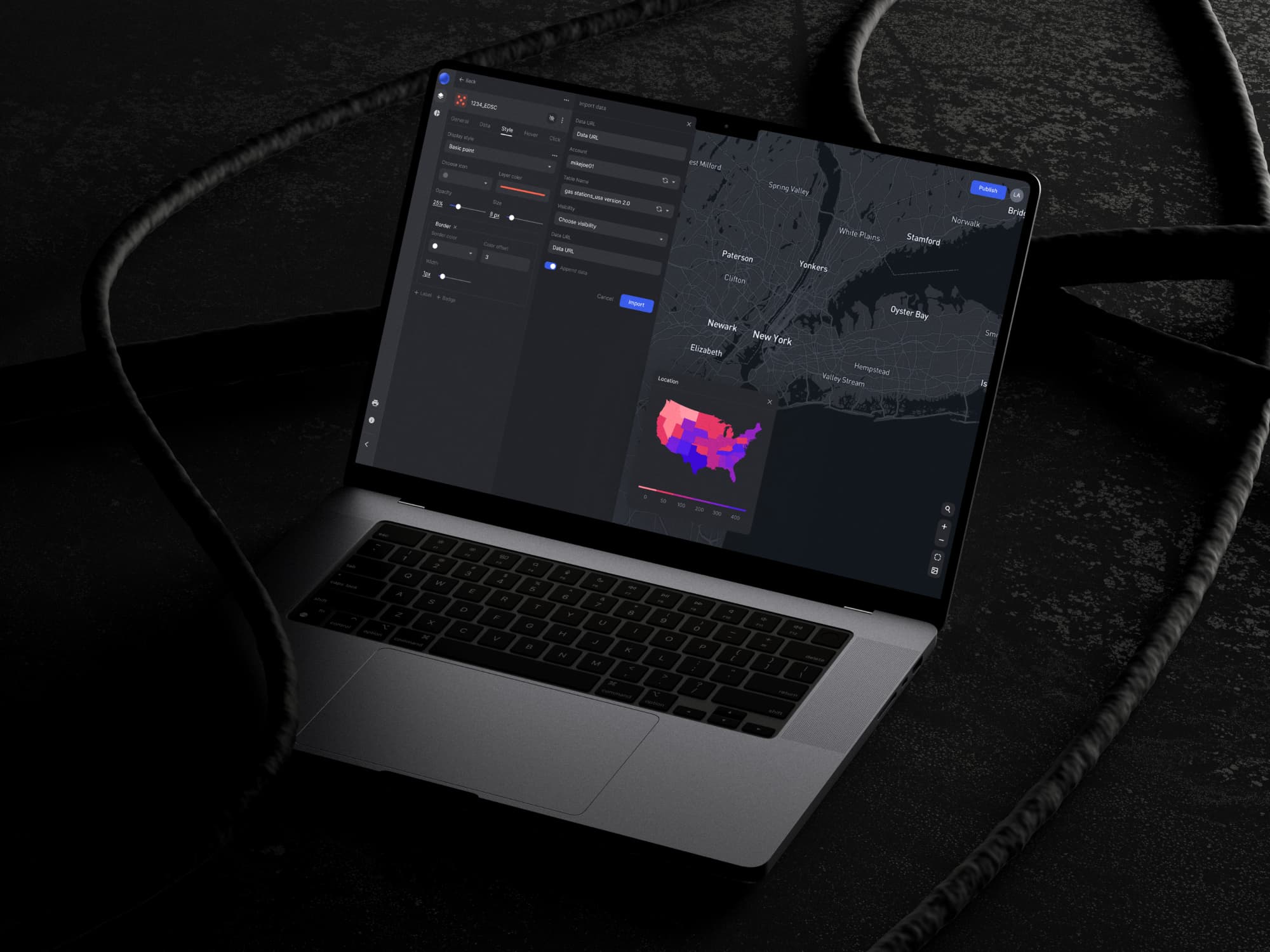
Combined with real-time data synchronization, this tool for data visualization ensures that users always have access to up-to-date information. This functionality enables businesses to make informed decisions based on accurate and relevant data, helping them respond effectively to dynamic conditions.
Requirements
The client had a large operations team. They have been working in the online data visualization software market for 10+ years and cooperate with market giants such as General Motors, General Electric, and Walmart. They were looking for a highly specialized company with extensive experience in designing and developing complex web applications to extend their team.
We began by diving into research on their enterprise product, bringing our experience with modern technologies to their company.
Here's a list of the areas we focused on revamping:
Solution
You may also like
See examples of real products we’ve built and the impact they’ve made for our clients.

Embryonics - AI IVF Company
Web App design & development | React.js, Redux, AWS
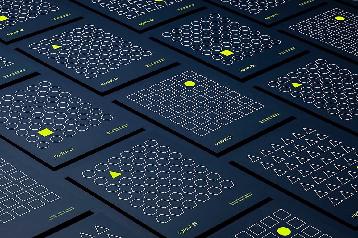
SignifAI (Acquired by New Relic)
Web development | React.js, Redux, AWS
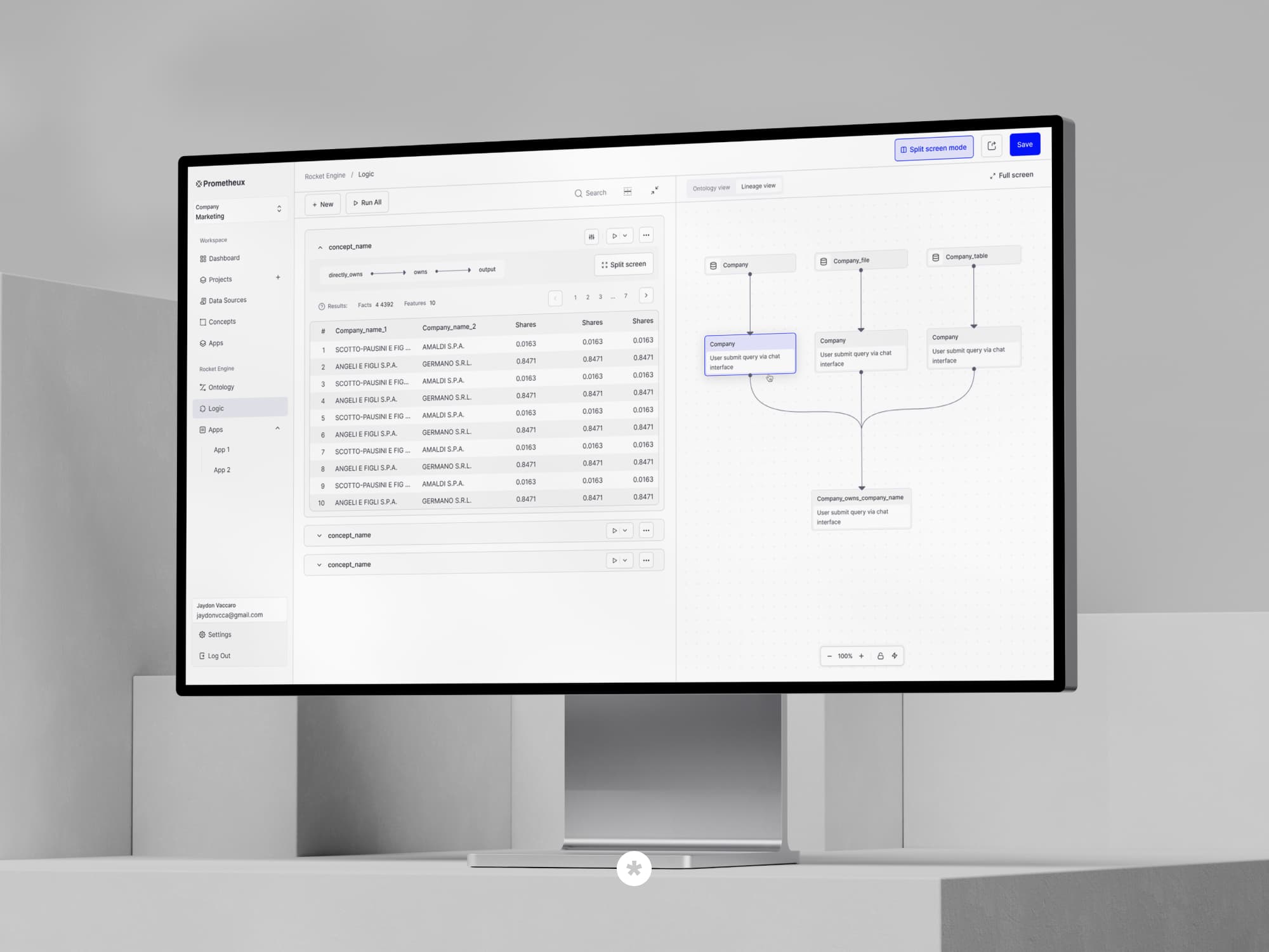
Prometheux - data foundation layer for AI
UX/UI Design
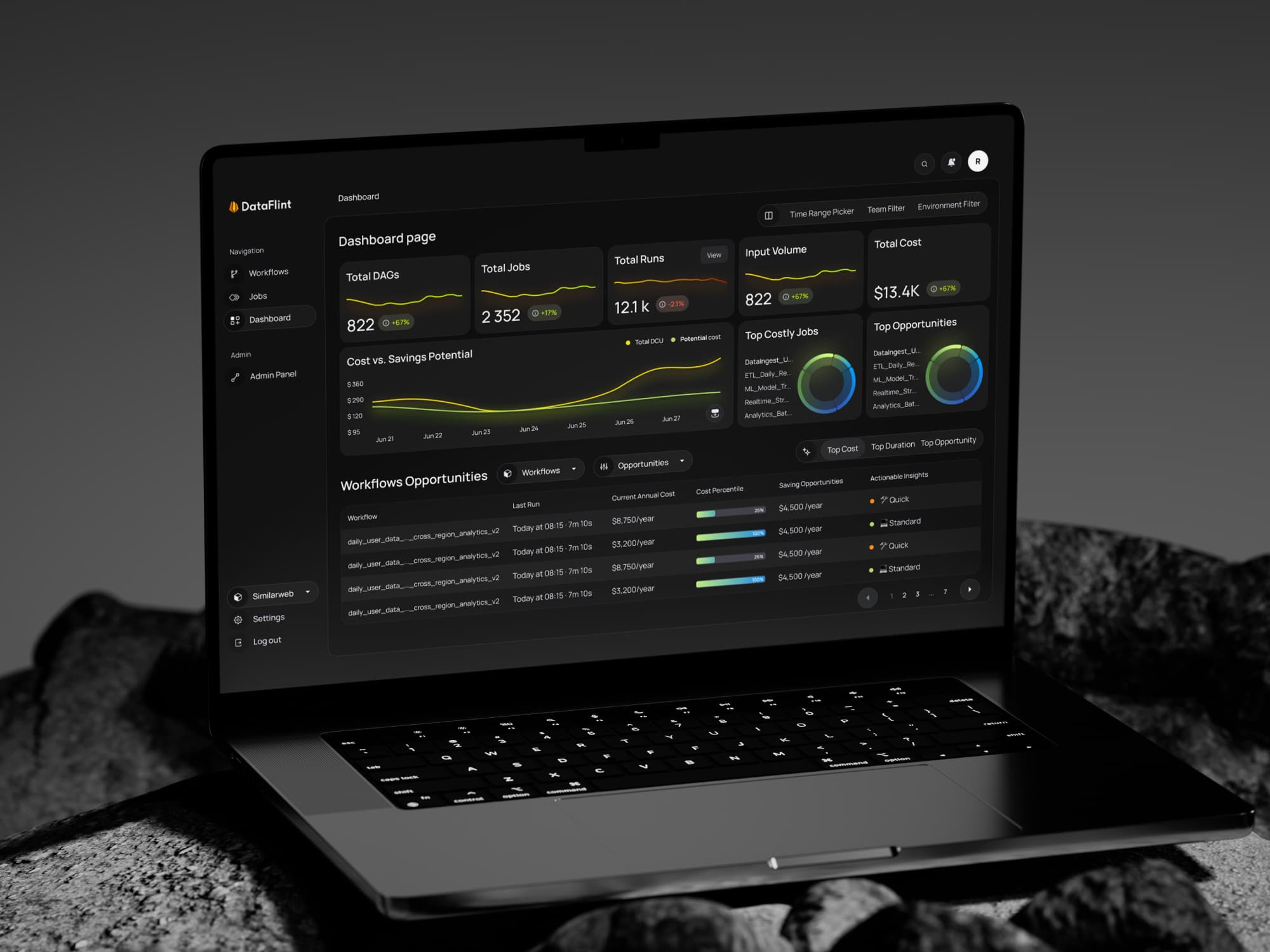
DataFlint - AI copilot for Apache Spark
UX/UI Design and Web development | React.js, Next.js
